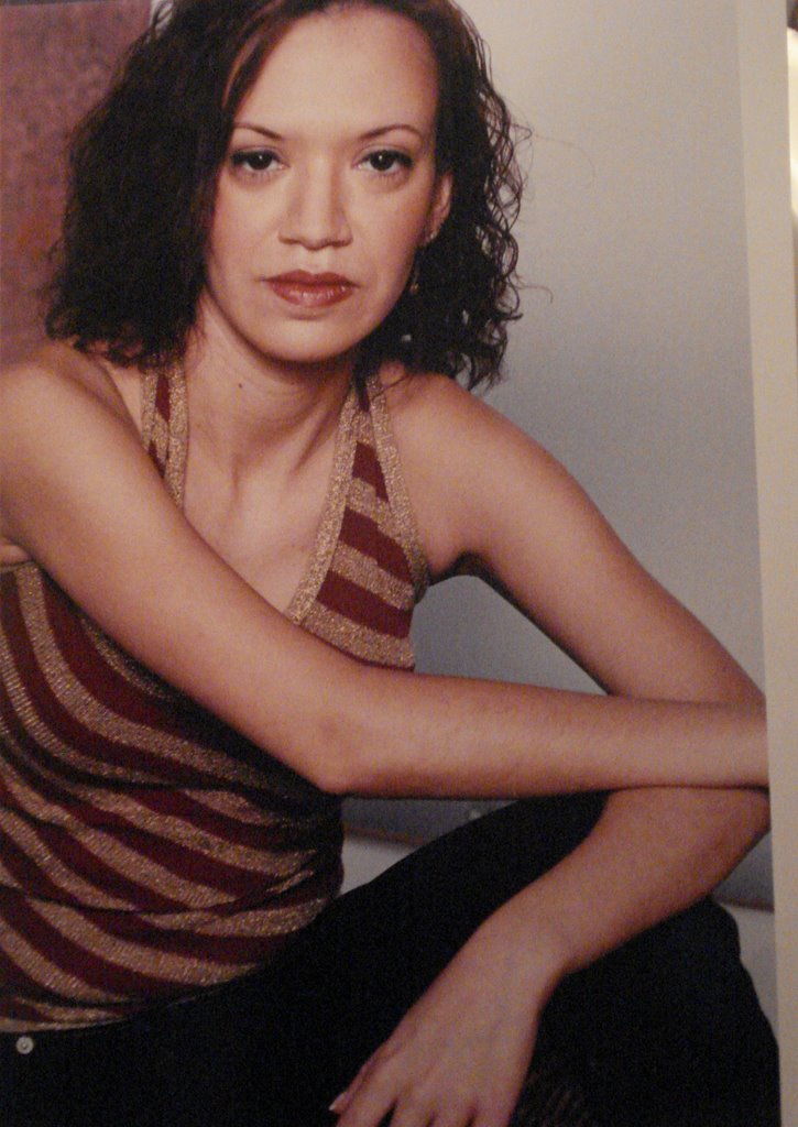
Think the B&W pics really quite striking; you should be very pleased & very proud of them. The colour ones, I think, evince the general difficulty of working with colour in this day and age; you look fine, but the contrasts don't work so well. The beautiful B&W really suits you. It captures the contrasts and the mysteries better. And, of course, it's just plain more ELEGANT. :-)
I agree...I was also thinking that it may be something about whether you're making "eye contact" with the camera or not. Since both the B&W you're looking away and colour you're not.
It reminds me of an interdisciplinary linguistics course I took where one guest lecturer talked about magazine covers where the model makes eye contact with the reader (calling that a "demand") vs. those where the model is looking away (calling that a "request"...I think). I think the "demand" pictures look more guarded.


3 Comments:
Hey, kiddo,
Think the B&W pics really quite striking; you should be very pleased & very proud of them. The colour ones, I think, evince the general difficulty of working with colour in this day and age; you look fine, but the contrasts don't work so well. The beautiful B&W really suits you. It captures the contrasts and the mysteries better. And, of course, it's just plain more ELEGANT. :-)
Thanks, I totally agree with you. I love the B&W's too.
I agree...I was also thinking that it may be something about whether you're making "eye contact" with the camera or not. Since both the B&W you're looking away and colour you're not.
It reminds me of an interdisciplinary linguistics course I took where one guest lecturer talked about magazine covers where the model makes eye contact with the reader (calling that a "demand") vs. those where the model is looking away (calling that a "request"...I think). I think the "demand" pictures look more guarded.
Post a Comment
<< Home